Advertisement
Edit Your Comment
Why same company stock charts(price curves) looks different?
Sep 16, 2019 at 10:15
Mar 11, 2014 부터 멤버
게시물3
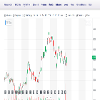
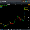
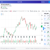
Does anyone know why stock charts looks different depending on the broker you use? I mean; same company two totally different charts(price curves). I added two charts here, hopefully they're visible. Both pictures are weekly charts and company is TCF FINANCIAL CORP. They look totally different in cmc markets compared to chart on finance.yahoo.com
Sep 16, 2019 부터 멤버
게시물10
Sep 16, 2019 at 10:57
Mar 11, 2014 부터 멤버
게시물3
here is a better picture where you can see the name of the company
Sep 16, 2019 at 11:34
Mar 11, 2014 부터 멤버
게시물3
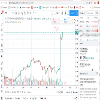
I also found one more chart which is different than these two others. It looks a bit like that cmc black chart, but if you look at the red arrow I drew there---> it's different

*상업적 사용 및 스팸은 허용되지 않으며 계정이 해지될 수 있습니다.
팁: 이미지/유튜브 URL을 게시하면 게시물에 자동으로 삽입됩니다!
팁: @기호를 입력하여 이 토론에 참여하는 사용자 이름을 자동으로 완성합니다.


